Note
Go to the end to download the full example code.
2.1 NGBoost (Disinfection Efficiency)
This file shows how to use ngboost for modeling disinfection efficiency of sonolysis.
import shap
import numpy as np

import seaborn as sns

import matplotlib.pyplot as plt

from ngboost import NGBRegressor

from easy_mpl import plot, bar_chart
from easy_mpl.utils import make_clrs_from_cmap

from ai4water import Model
from ai4water.utils import TrainTestSplit
from ai4water.postprocessing import PartialDependencePlot

from utils import SAVE
from utils import set_xticklabels, version_info
from utils import ci_from_dist, plot_1d_pdp, plot_stds
from utils import read_data, shap_scatter, residual_plot
from utils import set_rcParams, COLUMN_MAPS_, regression_plot
for lib, ver in version_info().items():
    print(lib, ver)
python 3.9.20 (main, Nov  5 2024, 16:07:55)
[GCC 11.4.0]
os posix
ai4water 1.07
easy_mpl 0.21.4
SeqMetrics 2.0.0
tensorflow 2.10.1
keras.api._v2.keras 2.10.0
numpy 1.21.6
pandas 1.5.3
matplotlib 3.7.1
h5py 3.13.0
sklearn 1.3.1
seaborn 0.13.2
ngboost 0.4.1
shap 0.41.0
set_rcParams()
data = read_data()

input_features = data.columns.tolist()[0:-1]
output_features = data.columns.tolist()[-1:]


TrainX, TestX, TrainY, TestY = TrainTestSplit(seed=313).split_by_random(
    data[input_features],
    data[output_features]
)
Model Building
ngb = NGBRegressor(early_stopping_rounds=40)

model = Model(
    model=ngb,
    mode="regression",
    category="ML",
    input_features=input_features,
    output_features=output_features,
    #wandb_config=dict(project="flowcam", entity="atherabbas", monitor="val_loss")
)
building ML model for
regression problem using NGBRegressor
Model training
rgr = model.fit(
    TrainX, TrainY.values,
    X_val=TestX,
    Y_val=TestY,
)
[iter 0] loss=4.4656 val_loss=4.7147 scale=1.0000 norm=15.9834
[iter 100] loss=3.5147 val_loss=3.6025 scale=2.0000 norm=11.2907
[iter 200] loss=3.0657 val_loss=3.1542 scale=2.0000 norm=8.2020
[iter 300] loss=2.8137 val_loss=2.9477 scale=2.0000 norm=6.9692
[iter 400] loss=2.7066 val_loss=2.8456 scale=2.0000 norm=6.5244
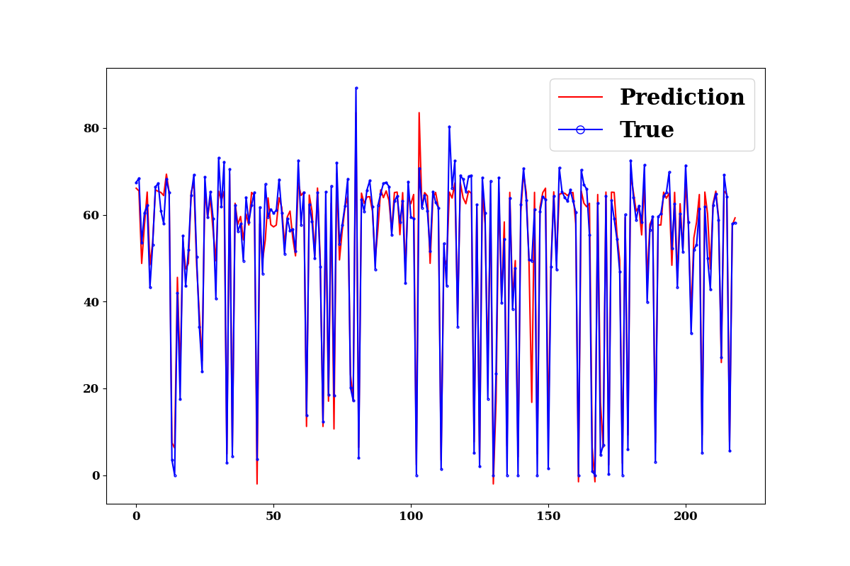
Prediction on training data
make prediction on training data
train_p = model.predict(
    TrainX.values, TrainY.values,
    log_on_wb=model.use_wb,
    prefix="train",
    plots=["prediction", "edf"],
    #max_iter=rgr.best_val_loss_itr
)
divide by zero encountered in true_divide
invalid value encountered in log
evaluate the model on training data
print(model.evaluate(
    TrainX, TrainY.values,
    metrics=["r2", "nse", "rmse", "mae"],
    #max_iter=rgr.best_val_loss_itr
))
{'r2': 0.95977096466093, 'nse': 0.9589725986188338, 'rmse': 4.380941376158224, 'mae': 3.0949118704995007}
train_dist = rgr.pred_dist(TrainX.iloc[0:50])

print(type(train_dist))
<class 'ngboost.distns.normal.Normal'>
train_std = train_dist.dist.std()
train_mean = train_dist.dist.mean()

plot_stds(
        train_mean,
        train_std,
        label= "Disinfection Efficiency (%)"
)
Now we get the negative log likelihood for training data. Negative log likelihood is another way of quantification of model performance.
print(-train_dist.logpdf(TrainY).mean())
33.71058154068604
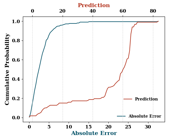
Prediction on test data
test_p = model.predict(TestX.values, TestY.values,
                  log_on_wb=model.use_wb,
                  plots=["prediction", "edf"],
                  #max_iter=rgr.best_val_loss_itr
                  )
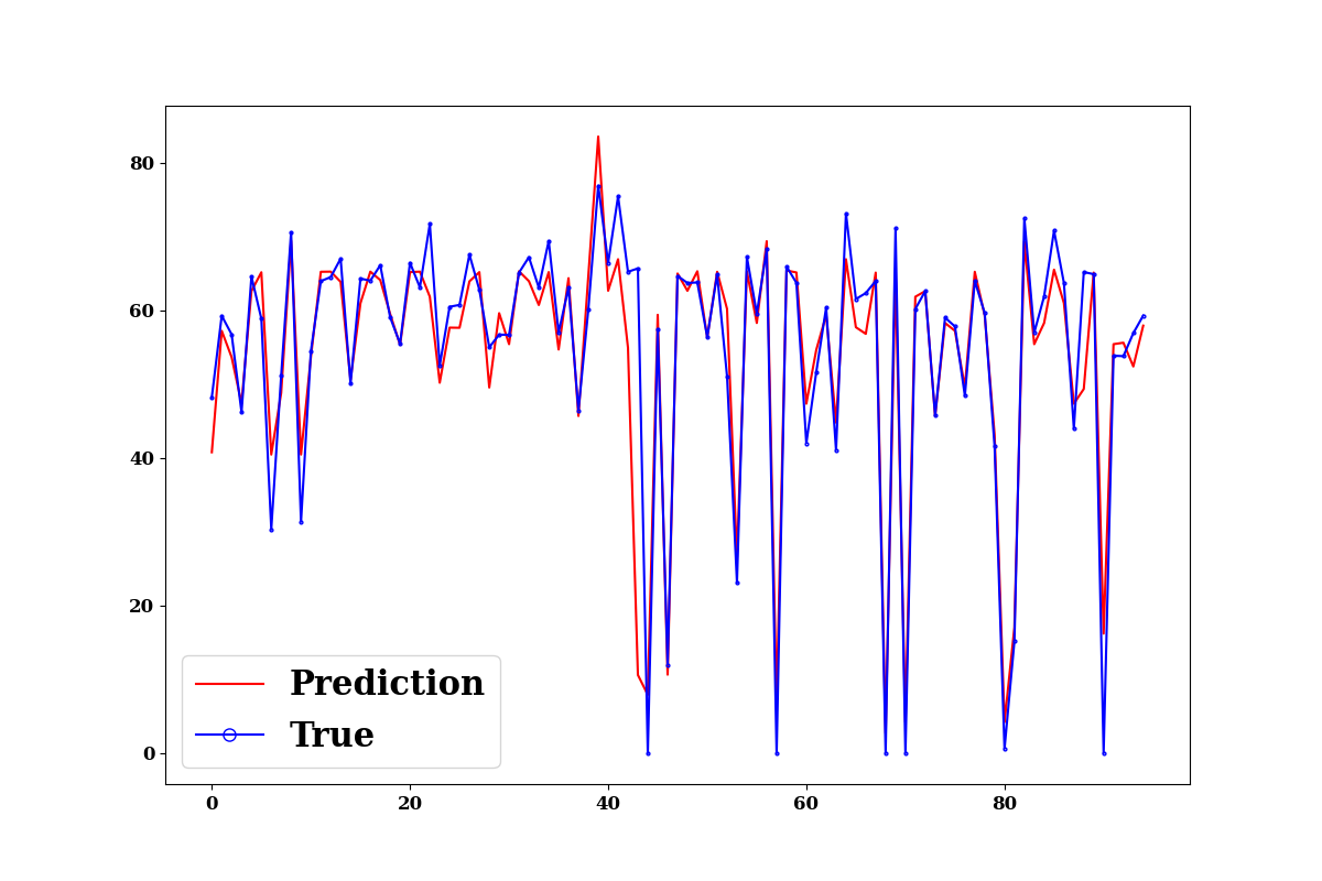
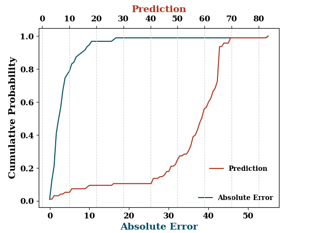
divide by zero encountered in true_divide
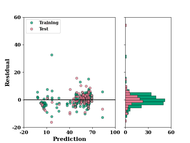
residual_plot(
    TrainY.values,
    train_p,
    TestY.values,
    test_p,
)
if SAVE:
    plt.savefig("results/figures/residue_ngb_eff", dpi=600, bbox_inches="tight")
plt.show()
Regression plot of training and test combined
ax = regression_plot(
    TrainY.values, train_p,
    TestY.values, test_p,
    label= "Disinfection Efficiency (%)")
ax.set_xlim([-2, 100])
ax.set_ylim([-2, 100])
if SAVE:
    plt.savefig("results/figures/reg_ngb_eff", dpi=600, bbox_inches="tight")
plt.show()
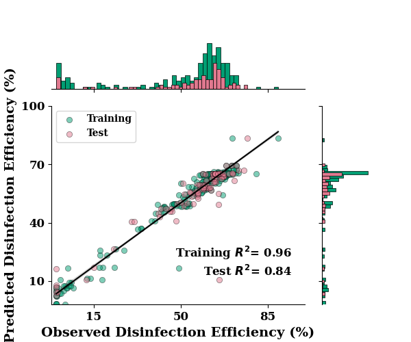
*c* argument looks like a single numeric RGB or RGBA sequence, which should be avoided as value-mapping will have precedence in case its length matches with *x* & *y*. Please use the *color* keyword-argument or provide a 2D array with a single row if you intend to specify the same RGB or RGBA value for all points.
print(model.evaluate(
    TestX, TestY.values,
    metrics=["r2", "nse", "rmse", "mae"],
    max_iter=rgr.best_val_loss_itr
))
{'r2': 0.8444807052078073, 'nse': 0.8424719568543588, 'rmse': 7.188939442202566, 'mae': 3.7397113143646306}
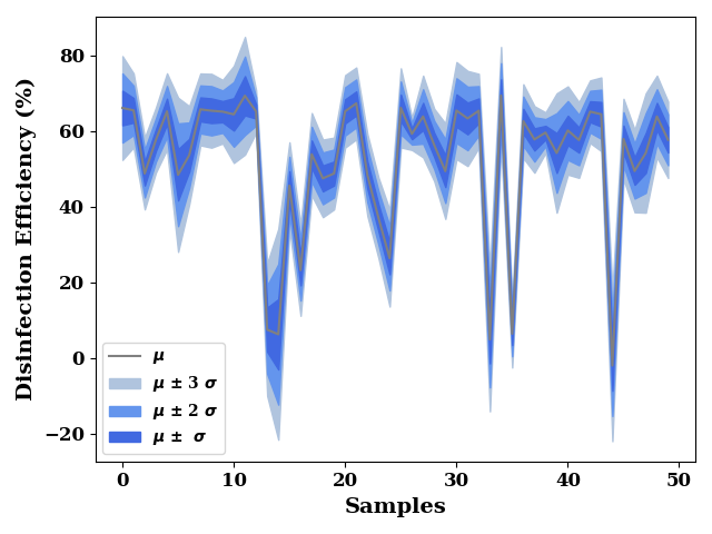
test_dist = rgr.pred_dist(TestX.iloc[0:50])
test_std = test_dist.dist.std()
test_mean = test_dist.dist.mean()

plot_stds(
        test_mean,
        test_std,
        label= "Disinfection Efficiency (%)"
)
get negative log likelihood on test data
test_dist = rgr.pred_dist(TestX)

print(-test_dist.logpdf(TestY).mean())
30.44333989412887
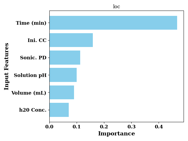
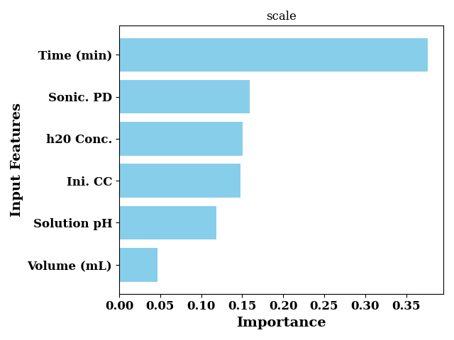
Feature Importance
Feature importance for loc trees
feature_importance_loc = rgr.feature_importances_[0]
Feature importance for scale trees
feature_importance_scale = rgr.feature_importances_[1]
bar_chart(
    feature_importance_loc,
    labels=input_features,
    color="skyblue",
    sort=True,
    ax_kws=dict(
        title="loc",
        ylabel="Input Features",
        xlabel="Importance"
    ),
    show=False
)
plt.tight_layout()
plt.show()
bar_chart(
    feature_importance_scale,
    labels=input_features,
    color="skyblue",
    sort=True,
    ax_kws=dict(
        title="scale",
        ylabel="Input Features",
        xlabel="Importance",
    ),
    show=False
)

plt.tight_layout()
plt.show()
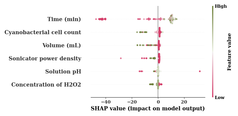
SHAP
SHAP plot for loc trees
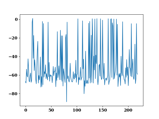
explainer = shap.TreeExplainer(rgr, model_output=0)
shap_values = explainer.shap_values(TrainX.values)

plot(shap_values.sum(axis=1) - TrainY.values.reshape(-1))
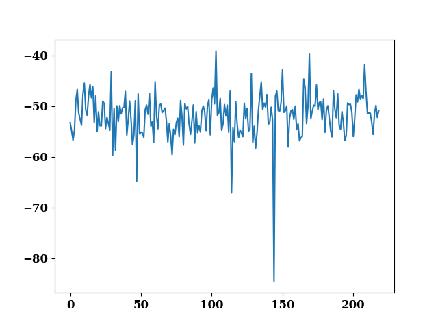
<Axes: >
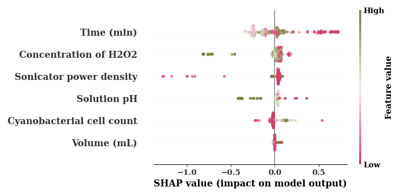
The default cmap is boring so use a different color map
cm = sns.diverging_palette(0,100, as_cmap=True)

feature_names = [COLUMN_MAPS_.get(fname, fname) for fname in input_features]
shap.summary_plot(shap_values,
                  TrainX.values,
                  feature_names=feature_names,
                  cmap=cm,
                  alpha=0.7,
                  show=False
                  )
if SAVE:
    plt.savefig(f"results/figures/ngb_shap_loc_eff.png", dpi=600, bbox_inches="tight")
plt.tight_layout()
plt.show()
No data for colormapping provided via 'c'. Parameters 'vmin', 'vmax' will be ignored
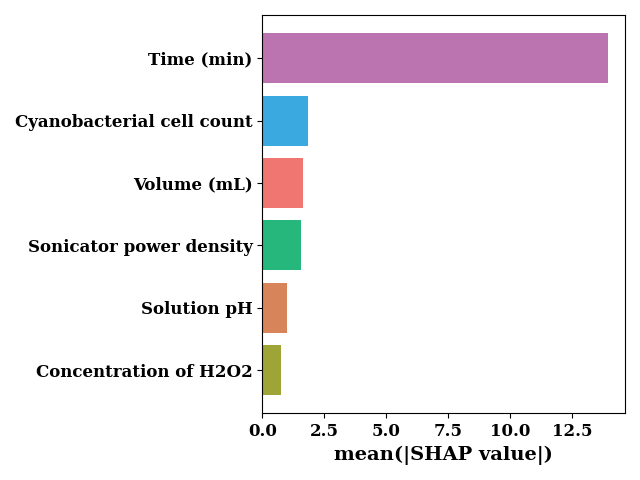
sv_bar = np.mean(np.abs(shap_values), axis=0)

bar_chart(
    sv_bar,
    feature_names,
    orient="horizontal",
    color=["#bb74b0", "#39a9e0", "#25b77c", "#9fa437", "#f07671", "#d7845b"],
    sort=True,
    show=False,
    ax_kws=dict(xlabel="mean(|SHAP value|)")
)
if SAVE:
    plt.savefig(f"results/figures/ngb_shap_loc_bar_eff.png", dpi=600,  bbox_inches="tight")
plt.tight_layout()
plt.show()
SHAP plot for scale trees
explainer = shap.TreeExplainer(rgr, model_output=1)
shap_values = explainer.shap_values(TrainX.values)

plot(shap_values.sum(axis=1) - TrainY.values.reshape(-1))
<Axes: >
feature_names = [COLUMN_MAPS_.get(fname, fname) for fname in input_features]
shap.summary_plot(shap_values,
                  TrainX.values,
                  feature_names=feature_names,
                  cmap=cm,
                  alpha=0.7,
                  show=False
                  )
if SAVE:
    plt.savefig(f"results/figures/ngb_shap_scale_eff.png", dpi=600, bbox_inches="tight")
plt.tight_layout()
plt.show()
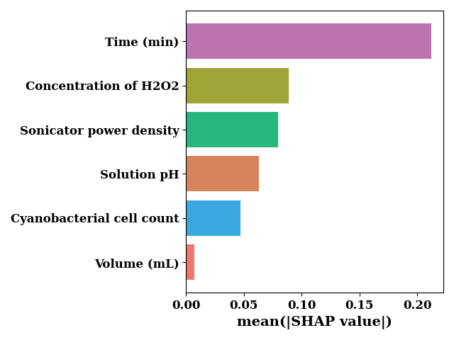
sv_bar = np.mean(np.abs(shap_values), axis=0)

bar_chart(
    sv_bar,
    feature_names,
    orient="horizontal",
    color=["#bb74b0", "#39a9e0", "#25b77c", "#9fa437", "#f07671", "#d7845b"],
    sort=True,
    show=False,
    ax_kws=dict(xlabel="mean(|SHAP value|)")
)
if SAVE:
    plt.savefig(f"results/figures/ngb_shap_scale_bar_eff.png", dpi=600, bbox_inches="tight")
plt.tight_layout()
plt.show()
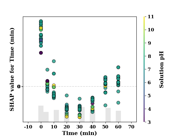
feature_name = 'Time (min)'
shap_scatter(
    shap_values[:, 0],
    TrainX.loc[:, feature_name],
    color_feature=TrainX.loc[:, 'Ini. CC'],
    feature_name=feature_name
)
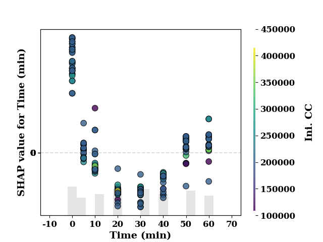
<Axes: xlabel='Time (min)', ylabel='SHAP value for Time (min)'>
feature_name = 'Time (min)'
shap_scatter(
    shap_values[:, 0],
    TrainX.loc[:, feature_name],
    color_feature=TrainX.loc[:, 'Sonic. PD'],
    feature_name=feature_name
)
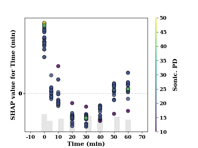
<Axes: xlabel='Time (min)', ylabel='SHAP value for Time (min)'>
feature_name = 'Time (min)'
shap_scatter(
    shap_values[:, 0],
    TrainX.loc[:, feature_name],
    color_feature=TrainX.loc[:, 'h20 Conc.'],
    feature_name=feature_name
)
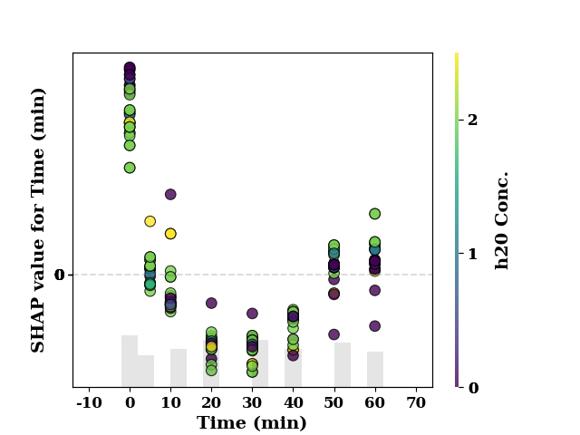
<Axes: xlabel='Time (min)', ylabel='SHAP value for Time (min)'>
feature_name = 'Time (min)'
shap_scatter(
    shap_values[:, 0],
    TrainX.loc[:, feature_name],
    color_feature=TrainX.loc[:, 'Volume (mL)'],
    feature_name=feature_name
)
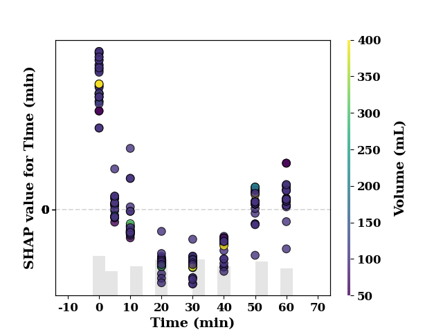
<Axes: xlabel='Time (min)', ylabel='SHAP value for Time (min)'>
feature_name = 'Time (min)'
shap_scatter(
    shap_values[:, 0],
    TrainX.loc[:, feature_name],
    color_feature=TrainX.loc[:, 'Solution pH'],
    feature_name=feature_name
)
<Axes: xlabel='Time (min)', ylabel='SHAP value for Time (min)'>
Partial Dependence Plot
pdp = PartialDependencePlot(
    model.predict,
    TrainX,
    num_points=20,
    feature_names=TrainX.columns.tolist(),
    show=False,
    save=False
)
plot_1d_pdp(pdp, TrainX.values, 'Time (min)')
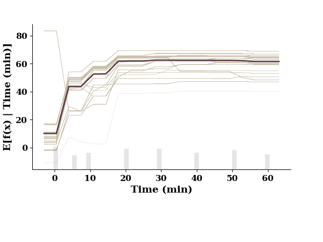
This figure includes Axes that are not compatible with tight_layout, so results might be incorrect.
plot_1d_pdp(pdp, TrainX.values, 'Ini. CC')
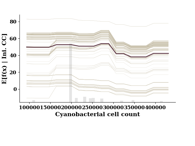
This figure includes Axes that are not compatible with tight_layout, so results might be incorrect.
plot_1d_pdp(pdp, TrainX.values, 'Sonic. PD')
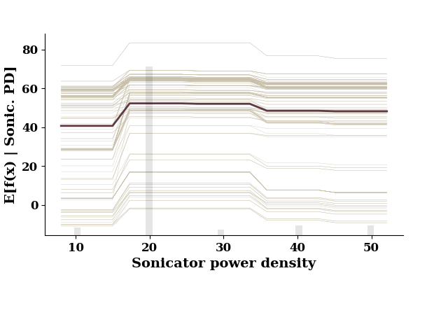
This figure includes Axes that are not compatible with tight_layout, so results might be incorrect.
plot_1d_pdp(pdp, TrainX.values, 'h20 Conc.')
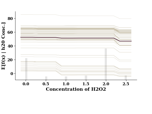
This figure includes Axes that are not compatible with tight_layout, so results might be incorrect.
plot_1d_pdp(pdp, TrainX.values, 'Volume (mL)')
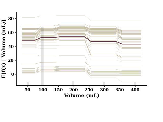
This figure includes Axes that are not compatible with tight_layout, so results might be incorrect.
plot_1d_pdp(pdp, TrainX.values, 'Solution pH')
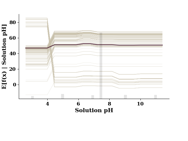
This figure includes Axes that are not compatible with tight_layout, so results might be incorrect.
if model.use_wb:
    model.wb_finish()
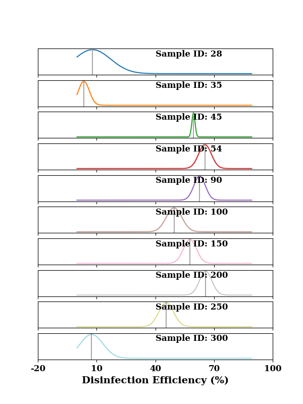
Now plot the probability distributions by for individual samples. The vertical line shows the prediction fromt he model. The width of the curve shows the uncertainly for a particular data point/sample. The larger the width, the greater is the uncertainty.
clrs = make_clrs_from_cmap(cm="tab20", num_cols=10)

y_pred_all = rgr.predict(data[input_features])
Y_dists = rgr.pred_dist(data[input_features])
y_range = np.linspace(data[output_features].min().item(),
                      data[output_features].max().item(), len(data))
dist_values = Y_dists.pdf(y_range.reshape(-1,1)).transpose()# plot index 0 and 114
indices = [28, 35, 45, 54, 90, 100, 150, 200, 250, 300]
fig, all_axes = plt.subplots(10, 1, sharex="all", figsize=(6, 8))

idx1 = 0
for idx, ax in zip(indices, all_axes.flat):
    ax = plot(y_range, dist_values[idx],
              color=clrs[idx1],
              ax=ax, show=False)
    ax.axvline(y_pred_all[idx], color="darkgray")
    ax.text(x=0.5, y=0.7, s=f"Sample ID: {idx}",
            transform=ax.transAxes,
            fontsize=12, weight="bold")

    ax.set_yticks([])

    idx1 += 1

set_xticklabels(ax)
ax.set_xlabel("Disinfection Efficiency (%)", fontsize=14, weight="bold")
if SAVE:
    plt.savefig("results/figures/local_pdfs_eff", dpi=600, bbox_inches="tight")
plt.show()
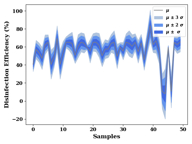
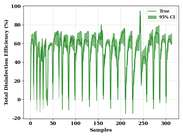
ci_from_dist(
    Y_dists,
    0.95,
    data[output_features].values,
    "Disinfection Efficiency (%)",
    fill_color = "forestgreen",
    line_color = "forestgreen"
)
if SAVE:
    plt.savefig("results/figures/ci_95_eff", dpi=600, bbox_inches="tight")
plt.tight_layout()
plt.show()
FixedFormatter should only be used together with FixedLocator
FixedFormatter should only be used together with FixedLocator
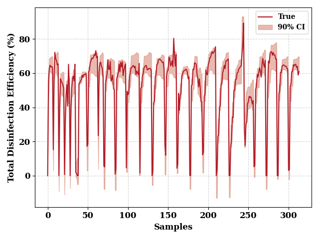
ci_from_dist(
    Y_dists,
    0.9,
    data[output_features].values,
     "Disinfection Efficiency (%)",
    fill_color = np.array([217, 140, 122])/255,
    line_color = np.array([180, 27, 40])/255
)
if SAVE:
    plt.savefig("results/figures/ci_90_eff", dpi=600, bbox_inches="tight")
plt.tight_layout()
plt.show()
FixedFormatter should only be used together with FixedLocator
FixedFormatter should only be used together with FixedLocator
Total running time of the script: (0 minutes 17.586 seconds)